This page created 22 Jan 2012
Version note: Applies to TMG 8 & 9
TMG comes supplied with a number of toolbars which allow the user to make various operations with just the click of a button instead of using menu commands. In addition, users can create custom Toolbars to provide buttons for functions not included in the standard toolbars. This article describes how to make use of this handy feature.
Topics Included in this Article |
|
| Using toolbars in TMG | |
| Toolbars with buttons of your choosing | |
| How to add buttons to a custom toolbar | |
| Adding buttons to run a specific Report | |
| Adding buttons to load a specific Accent condition | |
| Creating custom images for your buttons | |
I find a mixture of standard and custom toolbars works best for me, as illustrated in this screenshot:
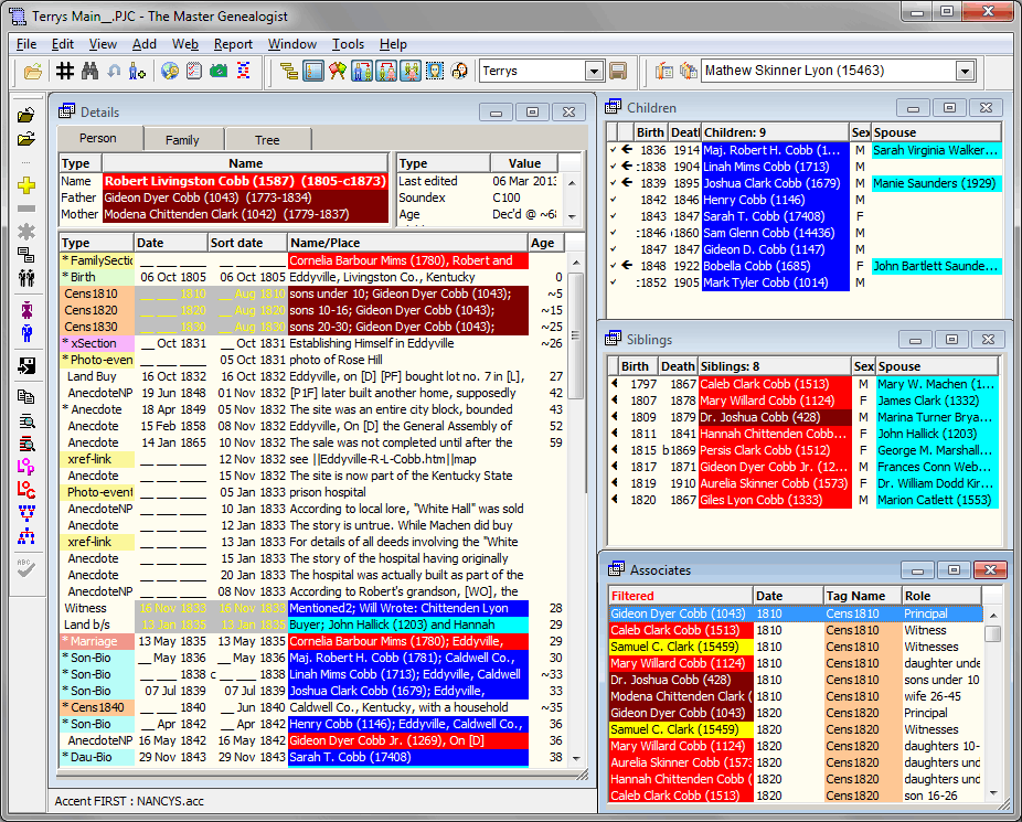
The three toolbars across the top of the screen are the standard toolbars called "Standard," "Layout," and "Bookmark." The upper toolbar on the left side is a custom toolbar, containing buttons I've found especially useful. The lower toolbar on the left is the standard toolbar "Text Editing." I'm not suggesting you would want to use the same toolbars I do, but hopefully examining some of the available options will suggest some ways you can make your copy of TMG work best for you.
TMG comes supplied with eight standard toolbars. The buttons on them typically activate functions that are also available on menu commands. But many users prefer the the convenience of selecting those functions with a single mouse click. The standard toolbars and the functions included in each are:
Only the "Standard," "Layout," and "Tag Editing" toolbars are displayed in the standard Layout. You can turn these or the others on or off by using the right-click menu on any toolbar, or using the View > Toolbars menu.
Toolbar buttons come in three sizes: Large with text (the default), Large, and Small. You can choose the size you prefer by right-clicking on any toolbar, or using the View > Toolbars menu. The "Large with text" size is illustrated below, and the "Small" size in the screenshot above.
Toolbars can be placed at the top or sides of the main screen as they are in screenshot above, or allowed to "float" anywhere in the screen. To move a toolbar, click and drag it by the "handle" - the small bar at the left of the screenshot below:
If you drag it near the top or a side, it automatically "docks" - that is attaches itself to that edge. If you leave in elsewhere in the screen it's appearance becomes more like a normal window, with a small title bar at the top.
Whether toolbars are on or off, their positions in the main TMG window, and the selected button size are all part of the Layout. If you want changes to the toolbars you have selected to be displayed the next time you open TMG, save the Layout before closing the program. Layouts are discussed in my article Working with Layouts.
In addition to the eight standard toolbars, you can create your own custom toolbars, including any buttons you find useful. An example of a custom toolbar is shown in the screenshot at the top of this page, along the upper left side of the screen.
If you find you use only a few buttons on one or more of the standard toolbars, you can include only those buttons on a custom toolbar and turn off the standard one to save space. Most, but not all, buttons on the standard toolbars can be added to a custom toolbar.
Most of the functions available in menu commands can also be accessed by toolbar buttons, many of which are not included in the standard toolbars. In addition, there are special functions, such as opening a specific Project, turning on a specific Accent, or running a specific report, that require several steps with menu commands or standard toolbars, but can be done with a single mouse click using buttons on a custom toolbar. My custom toolbar illustrated at the top of this article includes buttons to open my main project, switch accents between the ones for my ancestors and for my wife's, and run some of my commonly used reports.
You can create and name any number of custom toolbars, but only one can be displayed at any one time. If you create more than one custom toolbar, you can display a different one by accessing the Customize command on the View > Toolbars menu or the right-click menu on any toolbar, and choosing the desired toolbar from the drop-down list at the top of the Custom Toolbar Manager. For easier access, you can save separate Layouts with different custom toolbars, and then choose the Layout that includes the desired custom toolbar.
The next section describes how to add buttons to a custom toolbar.
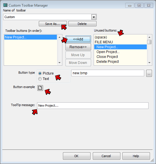
Adding buttons to a custom toolbar is relatively straightforward. First, you open the Custom Toolbar Manager, using the View > Toolbars > Customize... menu command, or by right-clicking on any toolbar and choosing Customize... from the right-click menu.
If you are creating more than one custom toolbar, use the Save As button at the top of the screen to give each custom toolbar a unique name. Otherwise, ignore this button and your toolbar will be saved with the default name "Custom."
Select the buttons you want to add from the list on the right – "Unused buttons." Note that most of the buttons are listed in the order of the menu commands they replicate. But after the menu commands there is a section called "Special Functions" which do not have corresponding menu commands. Some examples of their use are described in the sections below.
After selecting a button from the list, click the "<<Add" button in the center of the screen to add it to the list on the left – "Toolbar buttons." They will appear on the toolbar in the order listed, which can be changed with the "Move Up" and "Move Down" buttons. You can add as many buttons as you like, limited only by the amount of room the resulting toolbar will take up on your screen.
You can set the button to display as an image or as text, and set the "ToolTip" – the message that appears when you hover the mouse cursor over the button. To do that, select the button you want to work with in the list on the left, "Toolbar buttons" and use the controls in the lower half of the Custom Toolbar Manager screen.
Toolbar buttons may display images or text labels. Some buttons have default images associated with them, while others do not. If there is a default image, as for the New Project button shown in the screenshot above, the default choice for "Button Type" well be "Picture," and the default image will appear as the "Button Example." If not the default text will appear there.
If you want your button to contain text instead of an image, select the Text as the "Button Type" and enter the desired text in the box to the right. The button will expand to accommodate the text, so a brief label is generally best. The button with its text will appear below as the "Button Example." (The Large Buttons with Text actually contain the text as part of the image, so it cannot be changed except by editing the image.)
If your button doesn't have a default image, or you prefer a different image, select Picture as the "Button Type" and click the "Button Example" button open the Select Icon screen:
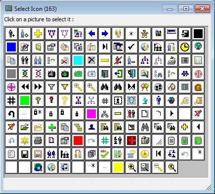
The screen will display the available buttons in the size you currently have specified for toolbar buttons. Click on the desired button to use it. If you don't find an acceptable button you can also create your own icons as described below, but of course that adds more complication.
When you are done, click OK to close the Custom Toolbar Manager. If you don't already have the custom toolbar displayed you will be prompted to display it – click Yes.
The default "ToolTip" appears below the "Button Example." You can change that to any text you like.
If the custom Toolbar is not already part of your custom Layout, it will not be displayed when you close and then restart TMG. To have it display each time, you need to arrange it where you want it to appear, than save the layout that includes it. See my article on Working with Layouts for details.
Buttons that do not correspond to menu commands, those listed in the Special Functions section of the "Unused buttons" list, generally require a few more steps to set up. The following sections describe some examples.
One handy application of custom toolbars is to add buttons for frequently-used reports. This might include custom "preview" reports in a style other than that used by the preview reports included in the "Reporting" toolbar, frequently used List of People or List of Citations reports, or just your favorite type of Journal report. This section describes how to do that.
Before you can place a report on toolbar button you must define and save a report definition in which the report options are specified. You should save the Report Definition with a distinctive name, so it doesn't get overwritten when you create other reports of the same type. You do that with the Add button at the top of the Report Definition screen.
If the report uses a Filter to specify the subjects, it's a good idea to save that Filter with a distinctive name so it's not accidentally overwritten for another purpose.
If you want the report to be created immediately after you click the button rather than displaying the Report Definition screen first, check the "Bypass the Report Definition Screen when the report is is called from the toolbar" box on the General tab of options.
Once the report definition is created, open the Custom Toolbar Manager using View > Toolbars > Customize... menu command or by right-clicking on any toolbar and choosing Customize... from the right-click menu, as described above. In the "Unused buttons" list on the right, scroll to near the bottom, under "Special Functions," and select "Load a report of a specific name," as shown in the following screenshot:
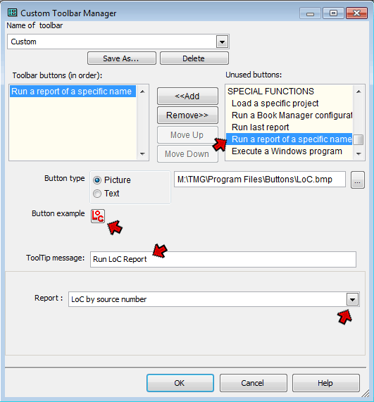
Add the button to the toolbar, as described previously. Then set the button type, enter a ToolTip message, and specify the Accent condition to be used.
Here I specified that a Picture should be used and selected a custom image. Using custom images is described in the last section of this article.
I entered a description of the report as a ToolTip message.
Finally, in the key part for adding a button of this type, I specified which report this button was to apply in the "Report" field from the drop-down list.
Accents can be used to color-code people using to any criteria you might specify. Details are discussed in my article on Using Accent Colors. Users who create several Accent Definitions for common use, such as I do for my ancestors and those of my wife, may want an easy way to change from one to another definition. I've found that adding buttons to the custom Toolbar to turn on each Accent works well. Here's how to do that:
Before you can place Accent conditions on toolbar button you must define and save each Accent condition, as described in the article mentioned above. Each Accent condition must be saved with a unique name.
Once you have defined the Accent conditions you want to use, open the Custom Toolbar Manager using View > Toolbars > Customize... menu command or by right-clicking on any toolbar and choosing Customize... from the right-click menu, as described above. In the "Unused buttons" list on the right, scroll to near the bottom, under "Special Functions," and select "Load a specific accent definition," as shown in the following screenshot:
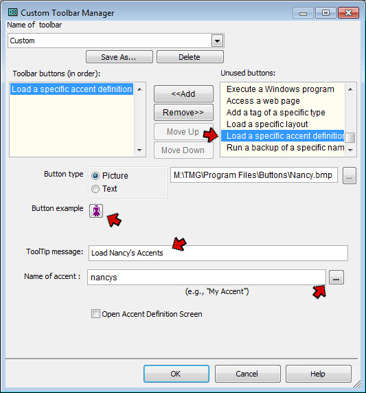
Add the button to the toolbar, as described previously. Then set the button type, enter a ToolTip message, and specify the Accent condition to be used.
Here I specified that a Picture should be used and selected a custom image. Using custom images is described in the following section.
Since I wanted to create buttons for two Accent conditions, one for my ancestors and another for my wife's I entered a description of this condition in the "ToolTip message" field.
Finally, in the key part for adding a button of this type, I specified which Accent condition this button was to apply in the "Name of accent" field. I did that by clicking the [ ... ] button at the bottom right, and selecting the desired condition.
If you want to add another button for a different Accent condition, repeat the process.
If you want to use an image for a toolbar button and none of the supplied images are acceptable, you can create your own, or find images elsewhere and use them. The simplest way to create new buttons is to copy an existing button image and edit it in an image editor. Since the buttons are very simple, the Paint application supplied with Windows is entirely adequate for this purpose.
Button images are stored in the Program Files/Buttons folder. The default location for this folder is as a sub folder under one of the following, depending on your operating system and whether you installed TMG for all users or just for yourself:
Operating System |
Default Folder Locations |
Windows Vista Windows 7 Windows 8 |
C:\ProgramData\The Master Genealogist v9\Buttons
C:\Users\{user}\AppData\Roaming\The Master Genealogist v9\Buttons |
Windows XP Windows 2000 |
C:\Documents and Settings\All Users\Application Data\The Master Genealogist
v9\Buttons
C:\Documents and Settings\{user}\Application Data\The Master Genealogist v9\Buttons |
To edit an existing button, find one as similar as possible to what you have in mind, in the desired size, and open it in Paint or another image editor. Modify it as desired, then save it in the button folder as a BMP or JPG image. After saving your custom image, you may have to right-click on the Select Icons screen and select "Update pictures from the Buttons folder" to make them visible for selection.
Here are some buttons I have created using this method that you are free to use if you like. Note that these are all sized for "small" buttons, and will appear quite small if you use the larger buttons sizes.
| My Application | My Application | |||
 |
copy Tag |  |
List of People report | |
 |
wife's Accents |  |
List of Sources report | |
 |
close Project |  |
List of Citations report |
To use these images, first click on the image above. When that image opens by itself in your browser, right-click on it and choose "Save image" or similar, depending on your browser. Save it in your buttons folder. (If you simply save the images above you will receive the JPG version, which does not have a clear background and it will display with a white square around the icon on your toolbar.)
If you prefer to create your own images from scratch or use an image from elsewhere, you should be aware of several considerations. The standard sizes of the images are as follows:
| Button Size | Image Size (pixels) |
| Small | 16 x 16 |
| Large | 24 x 24 |
| Large with text | 46 x 42 |
If your images are larger than the specified size for the button size you have specified, they will not appear in the Select Icon window. You can still select them using the [ ... ] button to the far right of the "Button type" box. However, only the center part of the image corresponding to the image size listed above will be displayed, which is unlikely to work well if the image is very much larger. You can try to reduce the image to the required size with an image editor, which may work acceptably, depending on the nature of the image.
The standard button images are in BMP format, but you can also use images in JPG format. The JPG format does not support transparent pixels, so if your graphic does not cover the entire image area the background will be the color specified in the image rather than the color of the toolbar background.
| ReigelRidge Home | Terry's Tips Home | Contact Terry |
Copyright 2000- by Terry Reigel